
Charles & Keith is a Singapore-based fashion brand that specializes in women's shoes and bags. Charles & Keith's designs are known for their clean lines, modern aesthetics, and attention to detail.
The brand is popular among fashion-conscious women who are looking for high-quality, stylish accessories at an accessible price point.
In recent years, Charles & Keith has also expanded into the online retail space, offering customers the convenience of shopping from their own homes through their website and mobile app. The brand continues to grow and evolve, offering new collections and expanding its product lines to meet the changing needs and preferences of its customers.
Understanding the brand
Objective (Task)
Create a fresh look for the Charles & Keith mobile application
(Homepage, Shopping Page, Product Detail Page and The Edit Page)
Target Audience
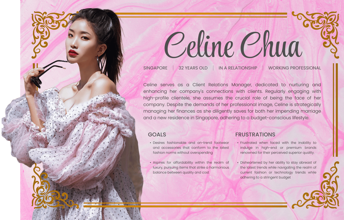
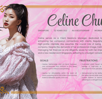
Charles and Keith's main target audience are price-conscious women who wish to treat themselves to "high-end purchases".
While luxury brands are often associated with high prices, there are some luxury brands that offer products at a more affordable price point, targeting price-conscious consumers. While these brands offer products at a lower price point than many other luxury brands, they are still considered luxury brands, and their products may still be more expensive than similar products from non-luxury brands.
Context
This was a design test as part of the hiring process for a Digital Designer role at Charles & Keith.
This was an individual design test and I was given a deadline of 1 week. Due to my internship commitments, I had limited time for this design test.
Style Direction
Minimalistic:
Charles & Keith often embraces a clean and minimalist design aesthetic. Their products are known for simple and sleek lines without excessive embellishments. Hence, I want to make the user interface clean and uncluttered, and simple and minimalistic without any loud visuals and graphics. This would enhance clarity and navigability while reducing the chances of overwhelmedness and cognitive load.
Monochromatic Colors:
Charles & Keith often employs a neutral color palette, including shades like black, white, beige, and metallics. This choice of colors contributes to the brand's timeless and sophisticated appeal. Therefore, I wish to stick to the color palette and not use any additional colors that are unnecessary to the brand image. This provides a unified and aesthetically pleasing user interface and emphasises the brand's simplicity, elegance, and timelessness.
Modern and Trendy:
The brand is known for staying on top of current fashion trends. Their designs often reflect modern styles and incorporate elements that are currently popular in the fashion industry. While staying minimalistic and simple, I still want users to feel that they are browsing through an app from a high-luxury brand. A modern and trendy user interface attracts users' attention and encourages them to explore the app and the products, increasing user experience and satisfaction.
User Persona
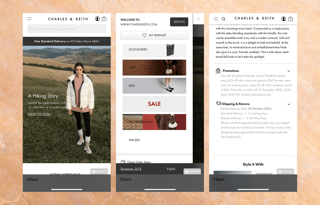
Charles & Keith's mobile app currently lacks a modern and dedicated feel for smartphone shoppers. The user interface relies heavily on elements reminiscent of webpages rather than providing an intuitive and streamlined experience for mobile users. The overall design lacks the aesthetic sophistication expected from a luxury brand, employing outdated UI designs.
The homepage appears unwelcoming, failing to engage users, and the navigation bar, tucked behind a sandwich menu, contributes to the web-like impression. Category names placed on images with busy backgrounds create poor contrast, hindering readability. Product detail pages suffer from excessive repetition of promotion and shipping details, which could be better organized on a separate page.
The placement of the 'back' button at the bottom of the screen, contrary to users' familiarity with its usual location at the top, adds to the lack of intuitiveness for new users. Additionally, the omnipresent 'message' button leading to a contact form on every screen is redundant.
To address these issues, I have proposed a set of style directions for the revamped mobile app, aligning with the brand image and values conveyed by Charles & Keith.
Heuristic Evaluation
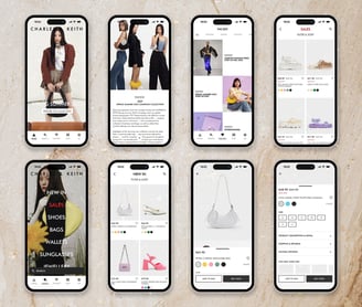
Final UI Design
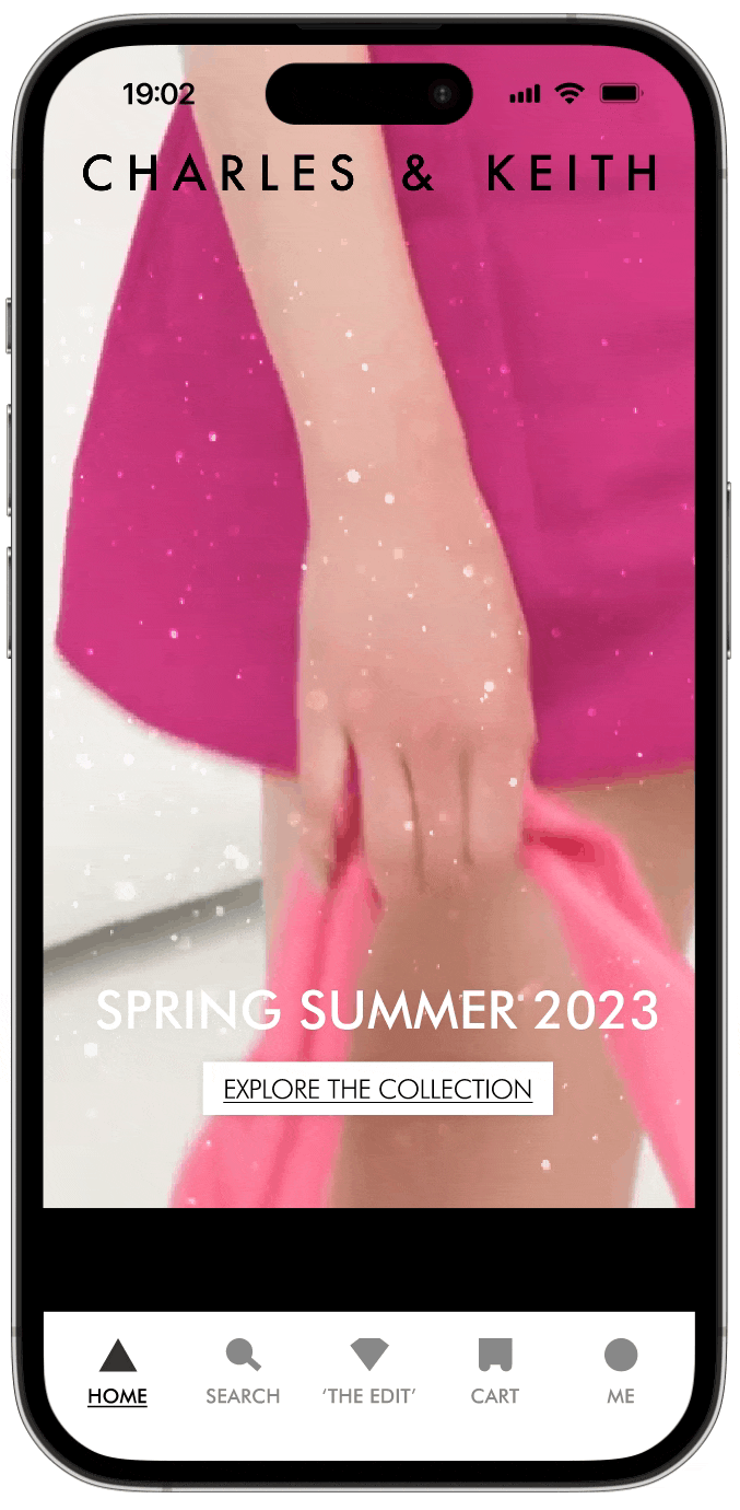
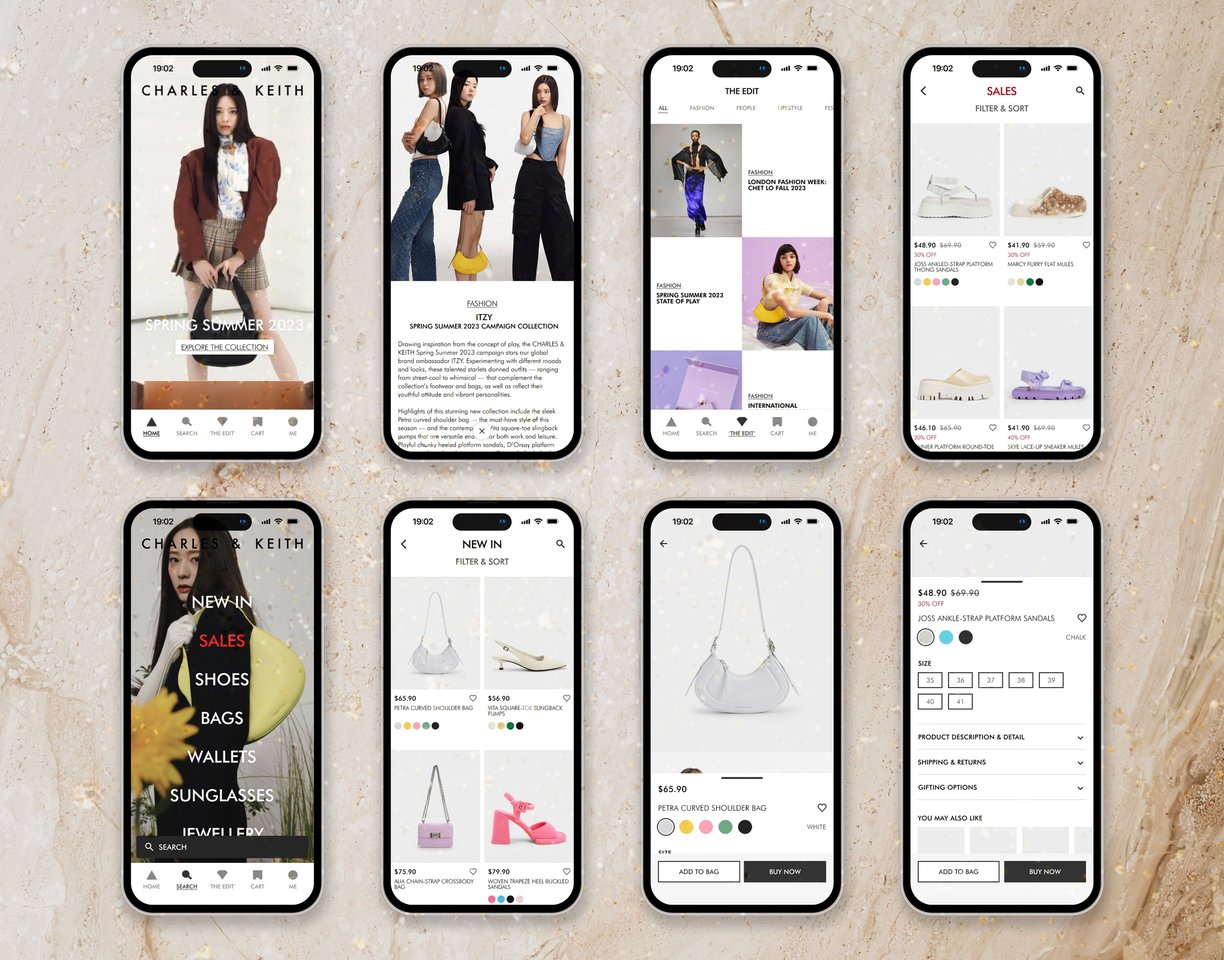
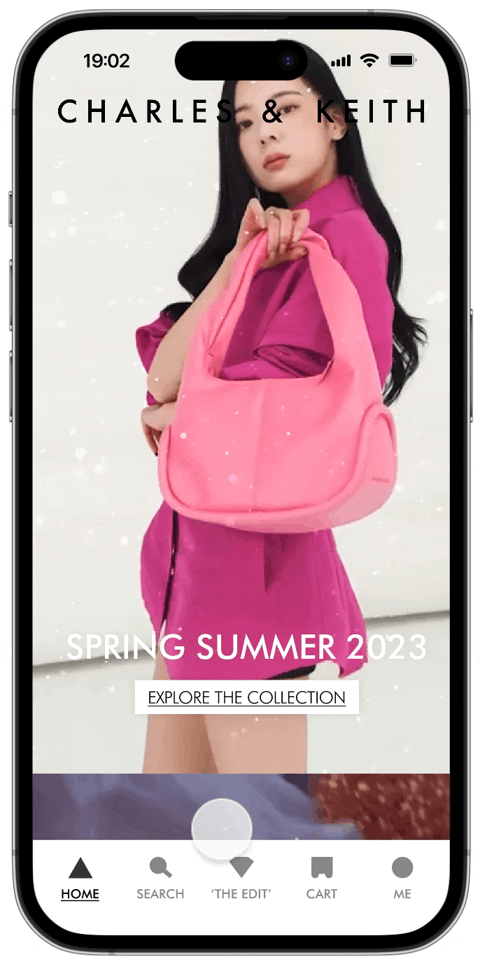
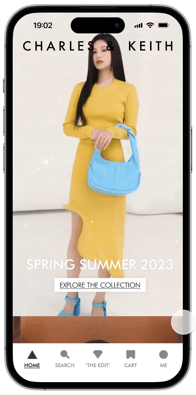
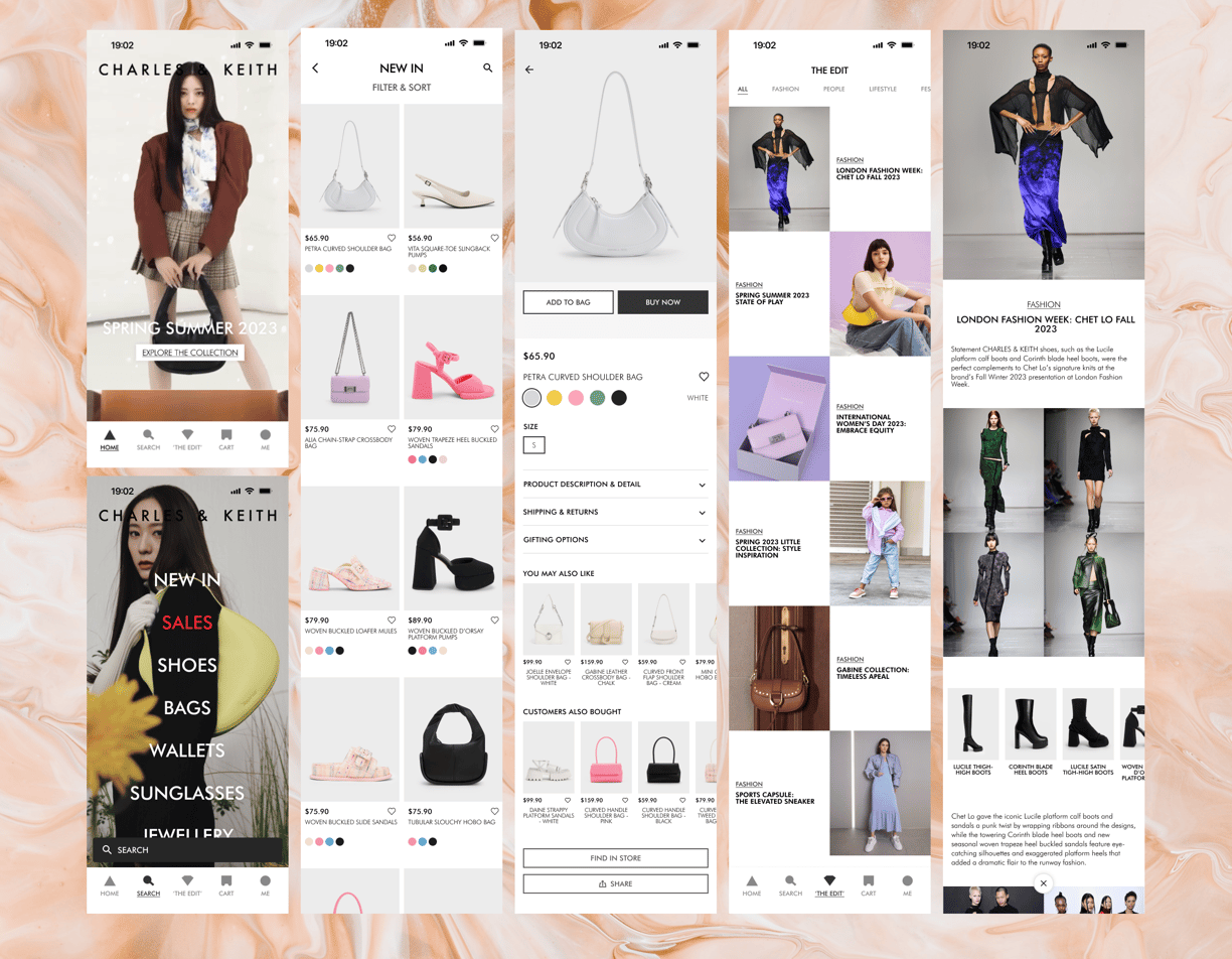
The prior homepage of Charles & Keith's mobile app lacked allure and felt stagnant. In response, I revitalized it by substituting the static image-dominated layout with dynamic videos showcasing Charles & Keith's collections. The revamped homepage now features multiple entry points leading users to explore diverse collections, fostering a more engaging and attention-grabbing experience. This strategic redesign aims to captivate users, encouraging them to immerse themselves in the brand's offerings. The relocation of the 'back' button to the top enhances user intuitiveness, while the elimination of the sandwich menu in favor of a bottom navigation bar streamlines user navigation across various sections of the app, providing a more user-friendly experience.
The 'Edit' page, serving as Charles & Keith's news hub, has been revamped to enhance the user's browsing experience. News articles are now presented in an engaging criss-cross pattern, adding a touch of trendiness and fun to the UI. Users can effortlessly navigate through the articles using the 'close' button conveniently positioned at the bottom of the screen, ensuring a seamless and enjoyable browsing experience.
The product categories, once nestled in the sandwich menu, now occupy an entire page, providing a more expansive and visually intuitive experience for users. In this redesign, users can effortlessly scroll through product shots, eliminating the need for repetitive tapping or swiping to explore different angles. Notably, the product category page showcases available colors, reducing redundancy by consolidating variations of the same item.
Furthermore, users can now 'favorite' items, allowing them to easily bookmark products of interest for a streamlined carting-out experience. To declutter the product detail page, details such as 'Shipping & Returns' have been discreetly tucked away, offering users the option to click and access additional information, maintaining a clean and simplified product browsing experience.
END