SHOPEE
Embraced by tens of millions of users on a daily basis, Shopee's platform is meticulously customized to meet the unique demands of each market and region it serves, ensuring a tailored and exceptional shopping experience for all.
Problem
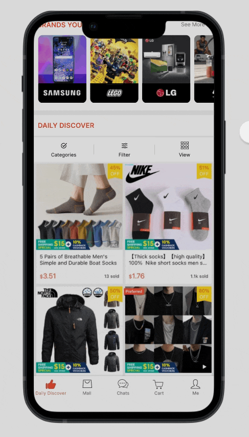
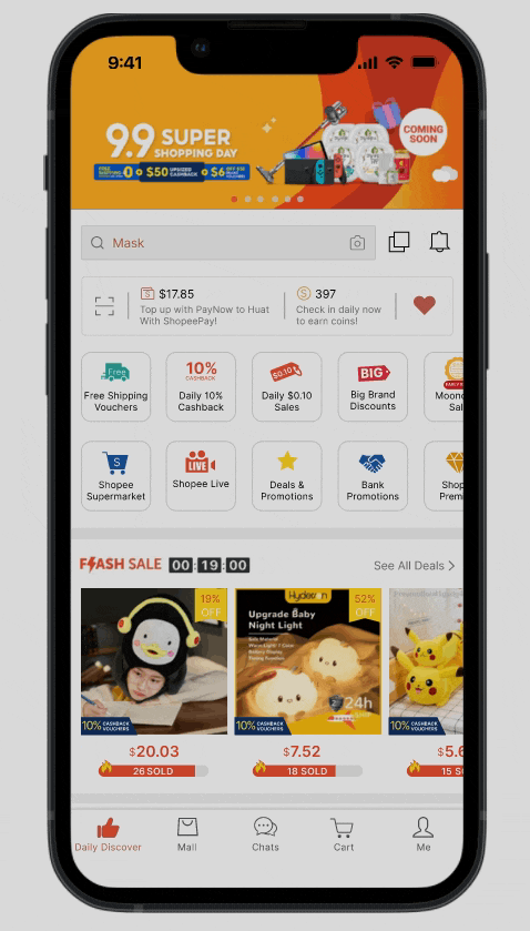
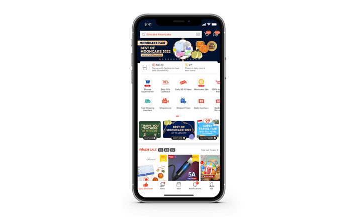
The home page is the first touch point of an e-commerce platform, making it a very important feature as it impacts GMV directly. Currently, the click rate performance of each module on the Shopee home page is assumed to not be good enough.
Mission
As a UI/UX designer, my mission is to redesign the Shopee home page for the 6+1 greater SEA region (Indonesia, Taiwan, Thailand, Vietnam, Malaysia, Singapore, and Philippines) to improve the performance of the overall click rate based on my experience and the limited information provided to me.
Discovery


Design Process
As the main purpose of UI/UX design is to improve the user experience by creating design solutions to users’ pain points, user research was the most important process for this redesign.
Therefore, I decided to use the 'Double Diamond' model to tackle this challenge as this model emphasises the importance of understanding and identifying problems first before starting the design process.
User Research
I interviewed 5 regular Shopee users to learn and understand their experiences and pain points which would give me valuable insights into possible interface designs. I plotted my findings into an aggregated empathy map to see an overview of their experience using the Shopee app.
User 1: 25 years old, Quantity Surveyor
User 2: 26 years old, Freelance Photographer
User 3: 26 years old, Insurance Agent
User 4: 28 years old, Concierge Officer
User 5: 29 years old, Admin Executive
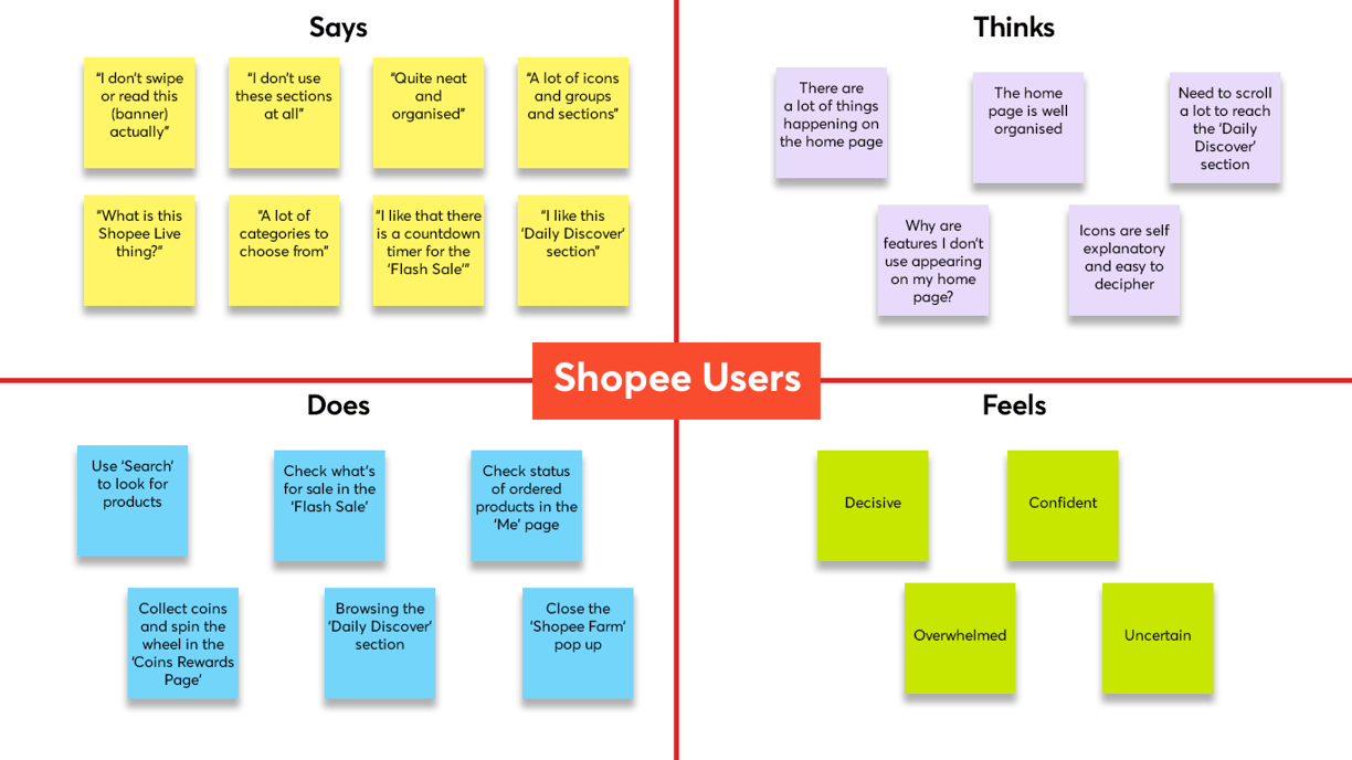
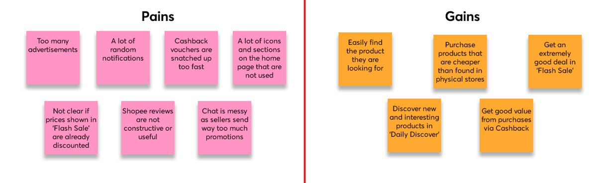
I further included a 'Pains' and 'Gains' section to the aggregated empathy map as I was able to identify their objectives for using the app and the obstacles they faced during their experience on Shopee during the interviews.
Competitor Research
I retrieved information on the rankings of Shopee and its competitors in the e-commerce industry from the iOS App Store and the Google Play Store. This allows me to determine Shopee's competitors so that I can start analysing their user interfaces and the user feedback on the respective platforms.
Information retrieved from MobileAction on 16 Aug 2022
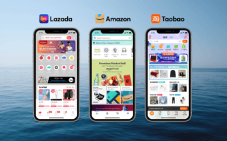
I decided to do further research into the user interface of Lazada, Amazon and 淘寶 (Taobao) who are the main competitors in my analysis from the 6+1 greater SEA region. I would keep their user interface designs in mind when redesigning the Shopee platform as their UI/UX design could be a contributing factor to their success in the market.

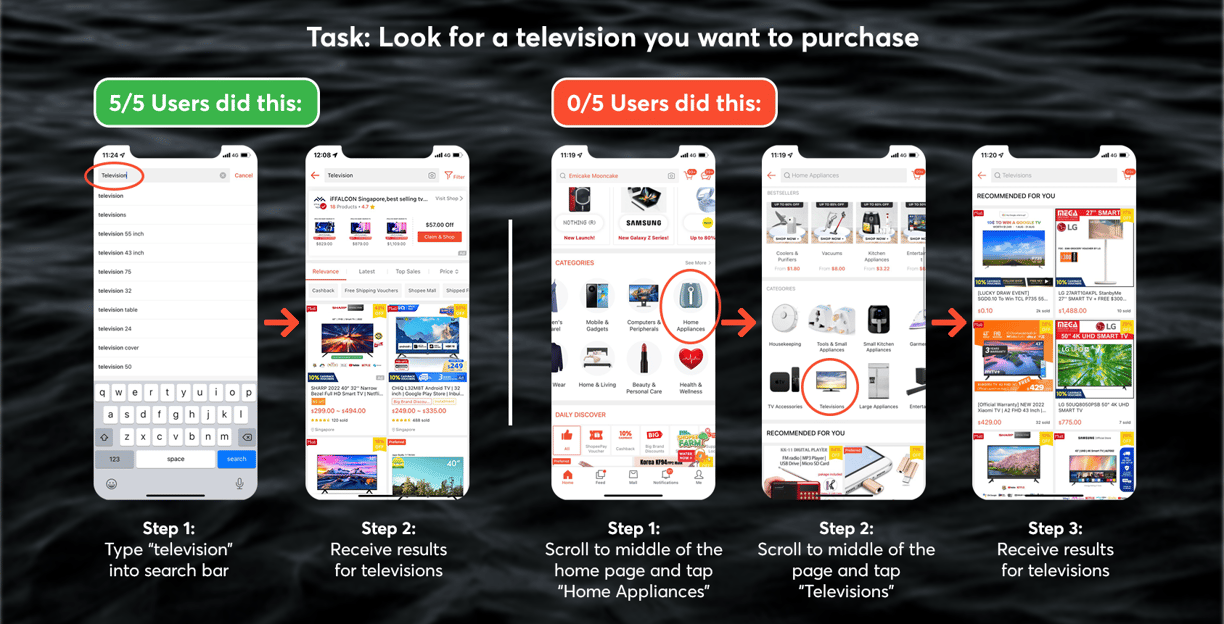
After interviewing the 5 users about their experience with Shopee and the home page, I tasked the users to look for a television to purchase.
My findings were very insightful. All the users would type "television" into the search bar instead of browsing through the categories section on the home page to reach the "Televisions" section in the "Home Appliances" category.
Secondary Research
Define
Based on the information discovered in my user and secondary research, I developed 3 user personas to gain a better understanding of Shopee users. This would allow me to create designs that are useful and valuable to them.
I then developed the user journey maps from these user personas to understand how their goals, emotions and pain points so that I can identify opportunities to improve their user experience.
User Personas
User Journey Maps
Personal Evaluation
As a regular Shopee user myself, I analysed the home page to see if there are any key issues or areas which could be improved upon.
Now that I have a clearer understanding of users' pain points while using the Shopee app, I will proceed to ideate some design ideas to solve these pain points on paper. These ideas are not set in stone and would be revised later.
Develop
Sketching

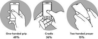
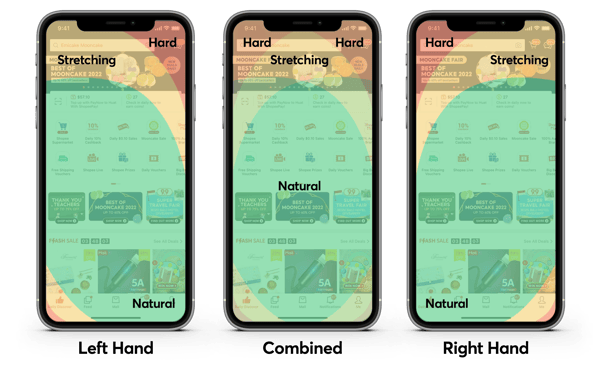
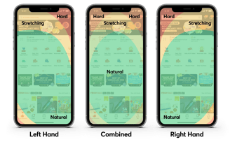
According to Steven Hoober's study, there were 3 main types of handholds:
1) One-handed grip was adopted by 49% of participants
2) Cradle was adopted by 36% of participants
3) Two-handed prayer was adopted by 15% of participants
This shows that 64% of participants use their thumbs to interact with their phones (one-handed grip + two-handed prayer). Therefore, it is important that Shopee places important modules within the thumb's reach to increase click rate performance.
The interface of a website or online application becomes more complex the more options it provides.
Adding an excessive amount of information to each component of your mobile app can not only be confusing or overwhelming to users but also create unnecessary clutter.
Studies have shown that having too many options frequently results in decision paralysis and choice overload. Reducing the number of choices is a good idea to improve click rate performance.
Goals
1) Reduce the amount of items that appear on the home page
2) Remove or relocate sections that are hardly used by most users
3) Add features that would enhance the user experience
4) Reorganise the home page's layout
With a deeper understanding of users' experience on Shopee, I scoped the key issues and pain points down into a set of goals to achieve for the redesign.
Wireframing
Deliver
Interactive Prototype
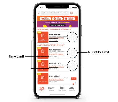
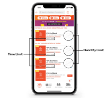
FOMO (fear of missing out), a psychological phenomenon, is frequently employed as a marketing tactic. Maintaining a sense of urgency and scarcity can cause FOMO in users. If we are able to convince users that they are not able to perform a certain action due to time or quantity limits, they would be more likely to perform said actions immediately. This could be used to encourage users to tap on the less popular modules on the home page.
Usability Testing
After developing the high-fidelity wireframe, I sent it to a few people for feedback and found some design issues. Below are the changes I made to the interface:
User Interface Redesign

Based on my sketches, I created wireframes in Figma to map out the basic structure of the app. This process allowed me to make changes to the layout easily and focus on the app's usability and functionality instead of the aesthetic details.
Additional Features
Reflection
In the newly added 'Filter' button in the 'Daily Discover' section, users are able to filter the products shown in the section by their pricing. There are checkboxes for quick filtering or users can input specific budget requirements here. This would allow the 'Daily Discover' section to show users more relevant products that are within their budget requirements.
On the 'Me' page, the newly added 'Customise Home Page' button allows users to remove any sections that they do not use from the home page. This would solve the pain point of users having to scroll past these sections to reach the more frequently used 'Daily Discover' section.
It was a pleasant challenge to give Shopee's home page a redesign. With a team of UI/UX experts at Shopee, I initially thought that the user experience and interface design would be near perfect and I would face difficulties finding areas for improvement. However, as I started analysing Shopee's interface, I discovered some pain points I've encountered during my browsing experience. I was also surprised that my interviewees also had a few pain points in regards to Shopee's home page.
Initially, I wanted to scrap my idea of moving the search bar down to be within thumb's reach. However, I decided to proceed with my idea after remembering iOS' implemented feature of moving down Safari's address bar in the mobile app for reachability purposes. I do wish to be able to test my redesign on more Shopee users to improve my current design ideas.
Nonetheless, this challenge has shown me that UI/UX designs would have to take into consideration of business goals, which would explain why the interface is filled with promotions and advertisements. A cleaner and less crowded home page would hinder Shopee's ability to notify users of promotions and sales, which would impact Shopee's GMV. I was also pleasantly surprised that I became very comfortable with the UX and UI design process and did not face any major difficulties. Moving forward, I would study more about UI design to improve my design skills to enhance users' visual experience while ensuring that the UI remains functional, accessible and easy to use.